Print Design
Redesign & Layout
.png)
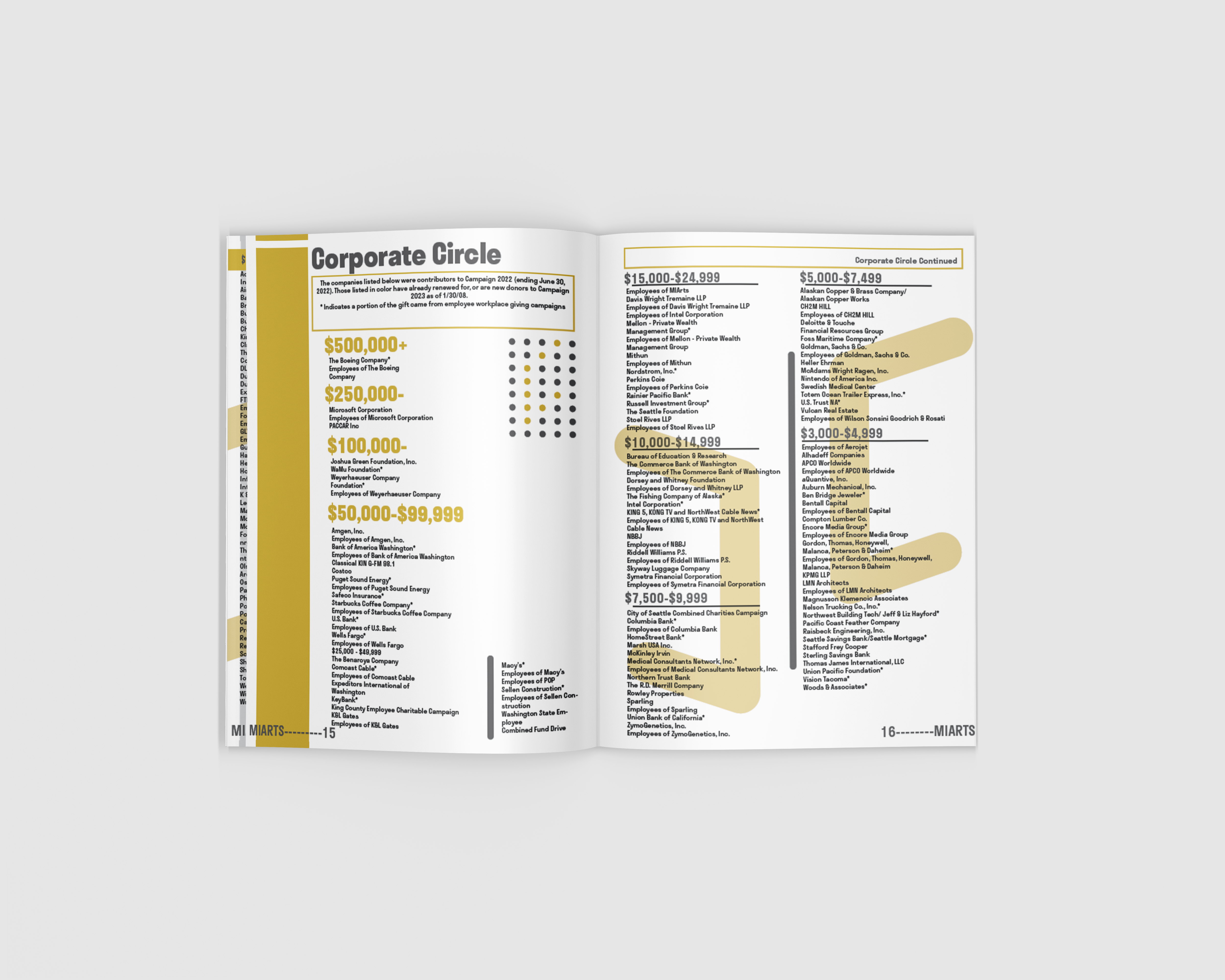
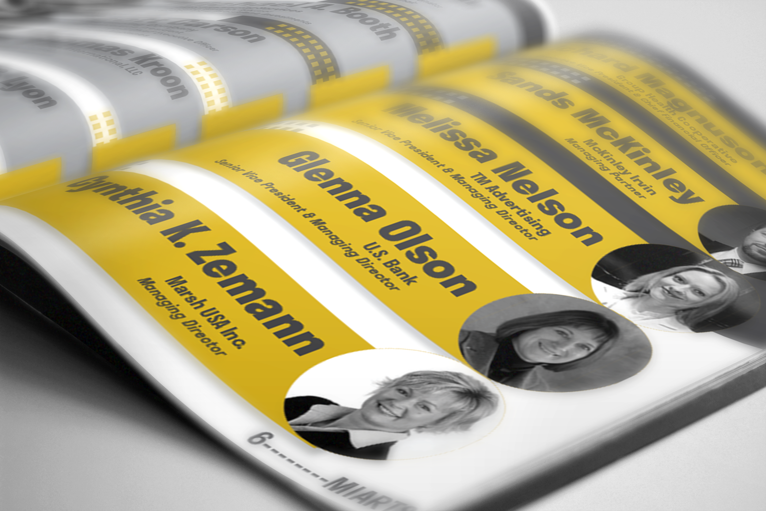
The original year-end donor update read like a dense document—weak hierarchy, long blocks, and key wins buried in the copy. We needed a format that clearly thanks MIARTS donors while surfacing outcomes and impact at a glance for both donors and broader stakeholders.
I rebuilt the piece as a modular, two-column newsletter in InDesign using MIARTS’ existing palette, imagery, and voice. Strong typographic hierarchy, clear grouping, and impact callouts make it easy to scan or read in depth. The result is a print- and web-ready thank-you that highlights achievements, improves readability, and engages non-donor audiences, too.
.png)
.png)